


Sourcing Guide: Sneaker Colorways for Young Consumers
Feb 02, 2026
Leave a message

Which colorways should I source for men's casual sneakers targeting young consumers when importing from China?
Picking the wrong sneaker colors can leave your capital trapped in dusty warehouse boxes. I know the stress of watching trends shift while your inventory stays still. Let's solve this together.
The most profitable colorways for young consumers currently include a mix of soft "Sail" neutrals, earthy "Gorpcore" tones like olive and mocha, and bold metallic silver accents. This combination balances timeless appeal with high-energy trends.
I have seen many buyers struggle to choose between "safe" colors and "trendy" ones. My goal is to show you how to blend both. You can keep reading to discover exactly which palettes will drive your sales next season.

How can I identify the trending sneaker color palettes for the upcoming season in my market?
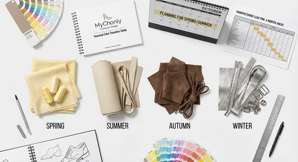
I often feel overwhelmed by how fast fashion moves. If you are like me, you want a clear map to follow so you do not waste money on shoes that nobody wants.
Identifying trends requires analyzing social media movements like "Blokecore" and monitoring high-end designer drops. Success comes from spotting shifts, such as the current move from bright "Triple White" to softer, vintage-inspired "Parchment" and "Sail" tones.
I have spent years watching the footwear market evolve from my base in Hangzhou. One major shift I am seeing right now is the "Vintage" or "Retro" movement. In the past, every young buyer wanted a pair of clean, clinical white sneakers. Today, that is changing. I see more Gen Z consumers reaching for "Sail," "Parchment," and "Ecru." These colors offer a softer look. They flow much better with the wide-leg trousers and baggy jeans that are popular today.
When I talk to my design teams in Fujian and Guangzhou, we focus on the Clean Fit aesthetic [1]. This style relies heavily on these off-white tones. It is not just about the color itself. It is about the feeling of heritage. A slightly yellowed midsole or a cream-colored leather upper makes a shoe look like it has a story. This is why I suggest you move away from pure, bright white. Instead, look for materials that have a natural, unbleached look.
Why the Vintage Aesthetic is Dominating
I believe this trend is here to stay because it is practical. Pure white shoes look dirty after one walk outside. "Sail" and "Parchment" tones are much more forgiving. They hide small scuffs and dust better. This makes them a smarter choice for daily wear. I also see this trend reflecting a desire for "slower" fashion. Young people want shoes that look like they could have come from their parents' closet in the 1990s.
Tools for Tracking Market Sentiment
I do not just guess what will be popular. I use specific data points to help my clients. You should look at what is happening on Instagram and TikTok. Look for the Blokecore movement [2]. This is where retro football culture meets everyday fashion. You will see a lot of primary colors like forest green and navy blue mixed with these neutral vintage bases.
Seasonal Color Transition Guide
| Season | Primary Base | Popular Accent | Target Vibe |
|---|---|---|---|
| Spring | Vanilla Yellow | Mint Green | Soft Utility |
| Summer | Parchment | Electric Blue | Digital Native |
| Autumn | Mocha Brown | Burnt Orange | Gorpcore |
| Winter | Slate Gray | Metallic Silver | Retro-Futuristic |
I suggest you use this table to plan your sourcing calendar. If you are importing from China, you need to think six months ahead. I always tell my buyers that what you see on the streets today is what you should have ordered yesterday.
What are the most popular eco-friendly material colors I should consider for young demographics?
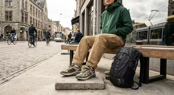
I care about the environment, and I know your customers do too. I find that choosing the right colors for eco-friendly materials can actually help you sell more shoes if you tell the right story.
The most popular colors for eco-conscious young buyers are earthy neutrals like olive green, mocha brown, and slate gray. These colors reflect the "Gorpcore" trend, which celebrates an outdoor-as-lifestyle aesthetic and pairs perfectly with sustainable, recycled materials.
In my experience at Mychonly, I have found that "Green" products should actually look "Earthly." When a customer sees a shoe made from recycled plastic or mushroom leather, they expect it to look natural. I highly recommend focusing on earthy neutrals. Olive green, mocha brown, and slate gray are performing very well in the North American and European markets right now. These colors are part of the Gorpcore trend [3]. This trend is all about wearing functional, outdoor gear in the city.
I see young people wanting to look like they just finished a hike, even if they are just going to a coffee shop. Earthy tones support this image perfectly. Furthermore, these colors work beautifully with multi-textured panels. In my factories, we often mix hairy suede, corduroy, and recycled mesh [4] in tonal shades. This adds a lot of depth to the shoe. It makes a casual sneaker feel like a premium, high-quality product.
The Power of Textures in Sustainable Design
I love using materials that have a bit of "character." When you use recycled fabrics, they often have a unique grain or texture. I think you should embrace this. Instead of trying to make a recycled material look like a perfect synthetic, use colors that highlight the texture. For example, a deep "Mocha Mousse" brown looks incredible on a textured, recycled suede. It gives the shoe a "hand-made" feel that young consumers value.
Matching Colors to Sustainable Materials
| Material Type | Recommended Color | Consumer Perception |
|---|---|---|
| Recycled Mesh | Slate Gray | Technical & Modern |
| Organic Canvas | Natural Ecru | Raw & Authentic |
| Vegan Suede | Forest Green | Premium & Eco-Friendly |
| Bio-based Rubber | Gum outsoles [5] | Classic & Durable |
I suggest using this matrix when you talk to your suppliers in China. It helps ensure that the material and the color are working together to tell the same story. If you pick a neon pink for an organic canvas shoe, it might confuse the buyer. I always aim for a cohesive look that feels "honest."
How do I choose between classic neutral tones and bold statement colors for my custom shoe line?
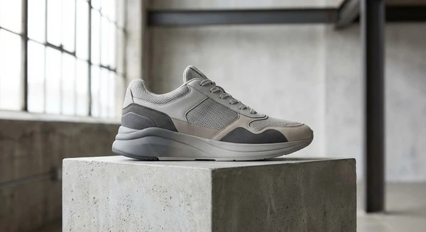
I face this dilemma every time I sit down to design a new collection for a client. I know you want to stand out, but you also need to make a profit.
I recommend a "70/30" rule: 70% of your stock should be in classic neutrals like light grey, off-white, and black. The remaining 30% should feature bold "statement" accents like metallic silver, "Cherry Red," or "Vibrant Citrus" to attract attention and appeal to fashion-forward buyers.
I have learned through my business that you cannot build a brand on neon colors alone. Most people still want shoes they can wear every day. This is why I always start with a base of neutrals. Light grey, often called "Rain Cloud" or "Stone," is a huge seller. It is the core of the tech runner trend [6] that is so popular right now. But, if you only sell grey shoes, your brand will look boring. I think you need that 30% of "spice."
I am currently very excited about metallic silver and chrome accents. This comes from the Retro-futuristic aesthetic [7]. It is inspired by running shoes from the early 2000s. I see young consumers using these metallic details to add a bit of "edge" to their outfits. It looks high-tech and modern. You do not need the whole shoe to be silver. Just a few panels or a metallic logo can make a huge difference.
The Rise of High-Contrast Accents
I also suggest looking at "Cherry Red" and "Vibrant Citrus." These are what I call "pop colors." They work best on low-profile silhouettes, like the "terrace" shoes used in football culture. A simple white shoe with a bright red stripe is a classic that young people love. It feels nostalgic but fresh. I find that these shoes are great for social media. They look "loud" in a photo, which helps get social media engagement [8] on your website or Instagram page.
Strategic Color Allocation
| Category | Color Example | Inventory % | Risk Level |
|---|---|---|---|
| Core Essentials | White / Off-White | 40% | Very Low |
| Modern Neutrals | Light Grey / Taupe | 30% | Low |
| Trend Accents | Forest Green / Burgundy | 20% | Medium |
| Statement Pieces | Metallic Silver / Neon | 10% | High |
I use this table to help my clients manage their risk. If you put 50% of your money into metallic silver shoes, you might get stuck with them. But if you keep it to 10%, it makes your whole collection look trendy without risking your entire budget.
Where can I find data on the best-selling sneaker colors for Gen Z and Millennial buyers?
I hate making decisions based on "gut feelings." I want you to have real evidence before you send your deposit to a factory in China.
I track data by analyzing "Blokecore" primary palettes on TikTok and studying the "2026 Color Drivers" from trend forecasting agencies. I focus on specific shades like "Mocha Mousse" and deep burgundy, which are projected to dominate the youth market for the next two years.

I spend a lot of time researching what is "next." If you are importing from China, you need to know what will be popular six to twelve months from now. I look at specialized color forecasting [9] reports. For example, "Mocha Mousse" and deep burgundy are going to be massive through 2026. These are sophisticated colors. They appeal to young adults who want to look a bit more mature but still stay "cool."
I also pay close attention to the Gen Z consumer behavior [10]. Gen Z consumers love things that look good on a screen. This is why I suggest looking at semi-transparent mesh and synthetic overlays. When you layer these materials, the colors change depending on the light. It creates a technical, "layered" look. I find this appeals to the "gamer" and "tech" culture that is so big right now.
Using Social Media as a Real-Time Lab
I use Instagram and TikTok as my laboratory. I don't just look at what influencers are wearing. I look at the comments. What are people asking for? Right now, I see a huge demand for "Blokecore" colors. This means primary colors like forest green and navy blue. This trend is driven by retro football culture. It is a very specific look that has a very loyal following.
Conclusion
I hope this guide helps you feel more confident in your sourcing. I believe that balancing classic "Sail" neutrals with bold "Blokecore" accents is the best path for your success.